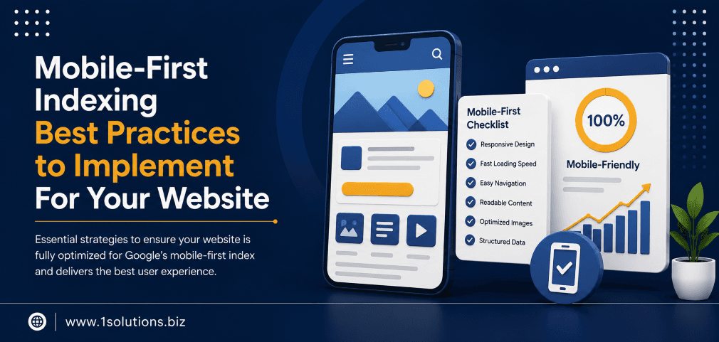
Mobile-First Indexing Best Practices to Implement For Your Website
Google officially completed its rollout of mobile-first indexing in 2023, meaning the mobile version of your website is now the primary version Google uses to crawl, index, and rank your pages. If your mobile experience is broken, thin, or slow, your rankings will reflect that, regardless of how polished your desktop site looks. Understanding and applying the right mobile-first indexing best practices to implement for your website is no longer optional. It is a core part of any competitive SEO strategy.
Google now uses your mobile site as the primary version for indexing and ranking. This guide walks you through every technical and content-level step you need to take, from responsive design and page speed to structured data and content parity, to make sure your mobile experience meets Google’s standards and protects your search visibility.
⚡ Key Takeaways
- Google indexes the mobile version of your site first, so any content missing on mobile is effectively invisible to search engines.
- Page speed is critical: 53% of mobile users abandon a site that takes longer than 3 seconds to load (Google, 2018).
- Responsive design is Google’s recommended approach, but dynamic serving and separate URLs also work if implemented correctly.
- Structured data, metadata, and internal links must be present and consistent on your mobile pages, not just desktop.
- Core Web Vitals scores directly influence your Google rankings and must be optimized for mobile viewports specifically.
- Content parity between desktop and mobile is non-negotiable. Hidden or collapsed content on mobile still needs to be crawlable.
- Regular auditing with tools like Google Search Console and Lighthouse is the only reliable way to catch and fix mobile indexing issues over time.
What Mobile-First Indexing Actually Means (and Why It Changes Everything)
Before mobile-first indexing, Google primarily used the desktop version of your site to determine rankings. The shift began around 2016 and became the default for all websites by 2023. Now, Googlebot predominantly crawls the web using a smartphone user agent. It looks at your mobile page to understand your content, evaluate your links, and assign rankings.
This matters because many websites were originally built with desktop as the primary experience. Their mobile versions often have stripped-down content, missing structured data, slower load times, or broken navigation. According to Statista (2024), mobile devices account for approximately 60% of global web traffic. Yet a significant number of websites still serve inferior experiences on smaller screens.
The practical implication is straightforward: if your desktop page has 1,200 words of content and your mobile page shows only 400 of those words, Google will evaluate your page based on those 400 words. The desktop content becomes largely irrelevant for indexing purposes.
💡 Pro Tip: Check how Googlebot sees your mobile pages by using the URL Inspection tool in Google Search Console. Switch the crawl type to “Smartphone” and compare the rendered HTML against your desktop version to spot content gaps immediately.
Step 1: Choose and Implement the Right Mobile Configuration
Google supports three approaches to serving mobile content. Each has trade-offs you should understand before committing to one.
Responsive Web Design
This is Google’s recommended configuration. A single URL serves the same HTML to all devices, and CSS media queries adjust the layout based on screen size. It is the simplest to maintain, avoids duplicate content issues, and consolidates your link equity. For most businesses, especially those using a platform like WordPress, responsive design is the default and the right choice. If you are building or rebuilding a site, partnering with a professional WordPress development team that prioritizes responsive architecture from the ground up saves significant remediation work later.
Dynamic Serving
The same URL serves different HTML depending on the user agent. This can work well but requires correct Vary HTTP header implementation so Googlebot knows different versions exist. Errors here can cause Googlebot to cache only one version incorrectly.
Separate Mobile URLs (m-dot sites)
A dedicated subdomain like m.example.com serves mobile users. This requires careful implementation of canonical tags and rel=”alternate” annotations. Maintenance overhead is high because you are essentially running two websites. Google supports this configuration but it introduces more points of failure.
| Configuration | Recommended By Google | Maintenance Effort | Risk of Content Parity Issues | Link Equity Impact |
|---|---|---|---|---|
| Responsive Design | Yes | Low | Low | Consolidated (best) |
| Dynamic Serving | Acceptable | Medium | Medium | Consolidated |
| Separate Mobile URLs | Acceptable | High | High | Split (requires careful canonicalization) |
Step 2: Ensure Full Content Parity Between Desktop and Mobile
Content parity is one of the most commonly overlooked aspects of mobile-first indexing. It means that whatever content exists on your desktop version, including text, images, videos, and links, must also be accessible and crawlable on your mobile version.
Common mistakes include:
- Using CSS to hide large text blocks on mobile with
display: noneorvisibility: hidden - Loading supplementary content only via desktop JavaScript that does not execute on mobile
- Removing internal links from the mobile navigation to simplify the layout
- Truncating product descriptions or blog content behind “read more” toggles that Googlebot does not expand
Importantly, Google has clarified that content hidden behind tabs or accordions on mobile is still considered indexable, as long as it loads in the initial page HTML and is not blocked by robots directives. The key issue is when content is simply absent from the mobile HTML entirely. Understanding why Google is not indexing certain pages often comes down to exactly this kind of mobile content gap.
Step 3: Optimize Page Speed and Core Web Vitals for Mobile
Speed and mobile-first indexing are deeply connected. According to Google’s own research (2018), 53% of mobile site visits are abandoned if a page takes longer than three seconds to load. More recently, Google’s Core Web Vitals have become official ranking signals, and they are measured primarily from field data collected on mobile devices.
The three Core Web Vitals you need to focus on are:
- Largest Contentful Paint (LCP): Measures how quickly the main content loads. Target under 2.5 seconds.
- Interaction to Next Paint (INP): Measures responsiveness to user interactions. Target under 200 milliseconds.
- Cumulative Layout Shift (CLS): Measures visual stability. Target a score under 0.1.
Practical steps to improve these scores on mobile include:
- Compress and serve images in next-gen formats like WebP or AVIF
- Implement lazy loading for images and iframes below the fold
- Reduce or defer render-blocking JavaScript and CSS
- Use a content delivery network (CDN) to reduce server response times
- Set explicit width and height attributes on images to prevent layout shifts
- Minimize third-party scripts that add to Total Blocking Time
Run your pages through Google PageSpeed Insights and set the analysis to mobile mode. The Lighthouse report will flag specific opportunities with estimated time savings for each fix.
💡 Pro Tip: Do not just optimize your homepage. Run Core Web Vitals audits on your top-traffic landing pages, product pages, and blog posts separately. Performance bottlenecks are often page-specific, not site-wide.
Step 4: Verify That Structured Data Is Present on Mobile Pages
Structured data markup, such as Schema.org JSON-LD, helps Google understand the context of your content and can enable rich results like star ratings, FAQs, and product prices in search. Many sites apply structured data only to desktop templates and forget to verify it renders correctly on mobile.
To check this, use Google’s Rich Results Test tool and enter your page URL. Make sure to test the mobile rendering. Confirm that all structured data types present on desktop, including Article, Product, BreadcrumbList, LocalBusiness, and FAQPage schemas, are also visible in the mobile HTML output.
This matters even more for ecommerce businesses. If your product schema is missing on mobile, your star ratings and price information may not appear in search results, directly affecting your click-through rates. A well-executed search engine optimization strategy must account for structured data parity as a baseline requirement, not an afterthought.
Step 5: Audit Internal Links and Navigation on Mobile
Internal linking is a critical SEO signal that helps Google discover pages and understand the relative importance of content across your site. On mobile, navigation menus are typically collapsed into hamburger menus, and some footer links may be removed entirely to save space. This creates a situation where Googlebot following a smartphone user agent cannot reach important pages that the desktop crawler would find easily.
Understanding how to use internal links to boost your SEO impact is relevant here because the same principles apply to mobile crawlability. Every important page should be reachable from your mobile navigation or from within your mobile content.
Steps to audit your mobile internal links:
- Use Screaming Frog or Sitebulb and set the user agent to Googlebot Smartphone
- Compare the crawl map against a desktop crawl to identify orphaned pages on mobile
- Check that your XML sitemap is linked from your robots.txt and includes all canonical URLs
- Verify that pagination links, breadcrumb links, and category links are present in mobile HTML
Step 6: Handle Images and Videos Correctly for Mobile Indexing
Images and videos need specific handling to be indexed and ranked in image search and video search from mobile. According to BrightEdge Research (2019), organic search drives over 51% of all website traffic, and image search is a meaningful component of that for many industries.
For images on mobile pages:
- Use descriptive, keyword-relevant alt text on all meaningful images
- Do not block image URLs in your robots.txt file
- Avoid using CSS background images for content images that you want indexed
- Use responsive image techniques such as
srcsetto serve appropriately sized images for mobile viewports
For videos embedded on mobile pages:
- Use VideoObject schema markup to provide metadata like title, description, and thumbnail URL
- Avoid embedding videos through iframes loaded only by desktop JavaScript
- Ensure video thumbnails are high quality and at least 1280×720 pixels as recommended by Google
If you are running an ecommerce store, product image quality and indexability on mobile is particularly important. This connects directly to broader visibility goals that ecommerce-focused SEO packages are designed to address comprehensively.
💡 Warning: Never block Googlebot from accessing CSS or JavaScript files in your robots.txt. If Google cannot render your mobile pages correctly due to blocked resources, it cannot evaluate your content accurately, which can suppress rankings even on well-optimized pages.
Step 7: Confirm Metadata Is Consistent and Complete on Mobile
Title tags and meta descriptions must be present and consistent across both mobile and desktop versions of your pages. This is especially relevant for sites using dynamic serving or separate mobile URLs where templates are managed independently.
Check for these issues specifically:
- Missing title tags on mobile-only templates
- Different canonical tags pointing to different URLs on mobile versus desktop
- Open Graph and Twitter Card metadata missing from mobile page headers
- Hreflang annotations, if applicable, present on both versions
Analyzing your page content for SEO signals is a foundational practice, and understanding how to boost your SEO efforts with page content analysis will help you build a consistent review process that covers mobile rendering as part of the workflow.
Step 8: Monitor and Maintain Mobile Performance Over Time
Mobile-first indexing is not a one-time fix. Sites evolve, new pages are added, third-party scripts change behavior, and Google updates its crawling and rendering capabilities. Consistent monitoring is what separates sites that maintain rankings from those that slowly decay.
Key tools and actions for ongoing monitoring:
- Google Search Console: Check the “Mobile Usability” report regularly for new errors. Review Coverage reports filtered by Googlebot Smartphone.
- PageSpeed Insights: Set up monthly tracking of Core Web Vitals scores on key page templates.
- Chrome User Experience Report (CrUX): This shows real-world performance data from actual users on mobile devices and feeds directly into Google’s ranking signals.
- Log file analysis: Review server logs to confirm Googlebot Smartphone is crawling your important pages at the expected frequency.
As Google continues to evolve its approach to search, including developments like AI Overviews and AI Mode, the foundation of a technically sound mobile experience becomes even more critical. AI-generated search results pull content from well-structured, fast, and accessible pages. The practices in this guide serve both traditional ranking goals and emerging AI-driven visibility.
Similarly, as agentic browsers begin to interact with web content on behalf of users, mobile-optimized, semantically clear page structures will be easier for these systems to interpret and act on.
Practical Action Plan: What to Prioritize Right Now
Not every business can fix everything at once. Here is how to triage your mobile-first indexing work by impact and urgency:
- Do This Now: Run a Google Search Console Mobile Usability audit and fix any flagged errors. These are direct signals that your pages are failing Google’s baseline standards. Also confirm content parity on your top 10 landing pages by comparing mobile HTML against desktop HTML using the URL Inspection tool.
- Do This Now: Measure Core Web Vitals for mobile in PageSpeed Insights for your homepage and highest-traffic pages. If LCP is above 4 seconds or CLS is above 0.25, these need immediate attention because they directly suppress rankings.
- Worth Doing: Audit your structured data with the Rich Results Test for mobile rendering on all page types that use schema. Fix any missing or invalid markup. This protects your rich result eligibility without requiring major technical changes.
- Worth Doing: Run a mobile crawl with Screaming Frog set to smartphone user agent and compare internal link counts per page against a desktop crawl. Add back critical links that are missing from mobile navigation.
- Low Priority: If your site is already on responsive design and passing Core Web Vitals, consider a deeper log file analysis to confirm crawl frequency and prioritization. This is useful for larger sites but is not urgent for most small to medium businesses.
- Low Priority: Review video schema implementation and image alt text completeness. These contribute to image and video search visibility but will not fix a site that has larger mobile rendering or speed issues.
How 1Solutions Helps You Get Mobile-First Indexing Right
Implementing mobile-first indexing best practices requires both technical depth and ongoing attention. At 1Solutions, we have spent over 15 years helping businesses build sites and SEO strategies that hold up under algorithm changes and evolving standards. Whether you need a full technical audit, a responsive site rebuild, or an ongoing optimization program, our team handles it end to end.
Our professional SEO services include mobile auditing, Core Web Vitals optimization, structured data implementation, and content parity reviews built into every engagement. If you are unsure where your site stands right now, our free 45-day SEO trial gives you a risk-free way to see measurable results before committing to a longer program.
Frequently Asked Questions
Does mobile-first indexing affect desktop-only websites?
Yes. If your website does not have a mobile-friendly version, Google will still attempt to index it using a smartphone user agent. The result is typically poor rendering, lower quality signals, and weaker rankings. Google may still index the page, but without a properly optimized mobile experience, you are at a significant disadvantage compared to competitors who have invested in mobile optimization.
Is responsive design mandatory, or can I keep my separate mobile site?
Responsive design is Google’s recommended approach but separate mobile URLs are still supported. If you maintain an m-dot site, you must implement rel=”alternate” and rel=”canonical” annotations correctly on both versions so Google understands the relationship between them. The maintenance burden is considerably higher than responsive design, and errors are more likely over time.
Will content hidden in accordions or tabs be indexed on mobile?
Yes, generally. Google has stated that content hidden in accordions or tabs is indexable as long as it exists in the initial HTML of the page and is not blocked from crawling. The key issue is content that is completely absent from mobile HTML, not content that is visually collapsed. That said, content that is fully visible tends to be weighted slightly more by Google, so avoid hiding primary keyword-rich content unnecessarily.
How do Core Web Vitals relate to mobile-first indexing?
Core Web Vitals became a Google ranking factor in 2021 through the Page Experience update. They are measured primarily using real-world data from mobile users collected via the Chrome User Experience Report. Because Google now indexes from mobile, and Core Web Vitals are measured on mobile, your mobile performance scores directly influence your rankings. A site that passes Core Web Vitals on desktop but fails on mobile will see that reflected in its search performance.
How often should I audit my site for mobile-first indexing issues?
At minimum, conduct a full mobile audit quarterly. However, you should monitor Google Search Console’s Mobile Usability and Coverage reports continuously, ideally setting up email alerts for new errors. After any significant site update, theme change, or plugin update, run an immediate spot check using the URL Inspection tool and PageSpeed Insights to catch regressions before they affect rankings at scale.