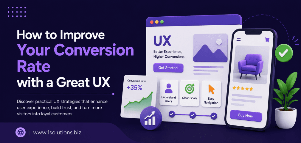
Knowing how to improve your conversion rate with a great UX is one of the highest-leverage skills in digital marketing. You can drive thousands of visitors to your website, but if the experience feels clunky, confusing, or slow, most of them will leave without taking any action. UX and conversion rate optimization are not separate disciplines. They are two sides of the same coin, and getting them aligned can dramatically change your business results.
Great UX removes friction from the path between a visitor’s intent and your desired action. This guide covers eight practical steps to improve your site experience, from page speed and navigation to trust signals and mobile design, so more visitors convert into leads and customers.
⚡ Key Takeaways
- Page load time directly affects bounce rate. Even a one-second delay can reduce conversions by up to 7% (Akamai, 2017).
- Clear navigation and logical information architecture reduce cognitive load and guide users to convert faster.
- Mobile-first design is no longer optional. Over 60% of web traffic comes from mobile devices (Statista, 2024).
- Trust signals like reviews, security badges, and clear policies reduce purchase anxiety at critical decision points.
- A/B testing is the only reliable way to validate UX changes. Never assume what works without data.
- Reducing form fields and simplifying checkout flows consistently lifts conversion rates across industries.
- Aligning UX improvements with your content and SEO strategy amplifies the return from both channels.
Why UX and Conversion Rate Are Inseparable
Conversion rate is simply the percentage of visitors who complete a goal, whether that is making a purchase, filling out a contact form, or signing up for a newsletter. UX, or user experience, determines how easy and pleasant it is to reach that goal. When UX is poor, visitors hit friction points and leave. When UX is strong, the path to conversion feels natural.
According to Forrester Research (2016), every dollar invested in UX returns up to $100 in value, representing a return on investment of 9,900%. That figure has been widely cited because it reflects a real pattern: small UX improvements compound over time into significant revenue gains. The challenge is knowing where to start and which improvements will have the biggest impact on your specific audience.
This guide walks you through a structured, step-by-step approach. Each section targets a specific area of UX that directly influences conversion behavior.
Step 1: Audit Your Current UX and Identify Friction Points
Before making any changes, you need a clear picture of where users are dropping off. A UX audit combines quantitative data from analytics with qualitative insight from real user behavior.
What to Look At
- Bounce rate by page: High bounce rates on specific pages signal that users are not finding what they expected.
- Exit pages: Pages where users most often leave the site before converting deserve immediate attention.
- Heatmaps and session recordings: Tools like Hotjar or Microsoft Clarity show where users click, scroll, and get stuck.
- Funnel drop-off rates: In Google Analytics (GA4), examine how many users drop off at each step of your conversion funnel.
- Form abandonment rate: If users start filling out forms but do not submit them, the form itself is the problem.
Document your findings in a prioritized list. Focus first on pages that receive the most traffic and have the worst conversion rates. These offer the highest potential return for any improvement you make.
💡 Pro Tip: Combine your UX audit with a content review. Weak or misaligned page content is often as responsible for poor conversions as bad design. Check out this guide on how to boost your SEO efforts with page content analysis to identify gaps that hurt both rankings and conversions.
Step 2: Fix Page Speed Before Anything Else
Page speed is the single most impactful technical UX factor for conversions. Akamai (2017) found that a 100-millisecond delay in page load time can reduce conversion rates by 7%. Google’s own research (2018) showed that as page load time increases from one second to ten seconds, the probability of a mobile visitor bouncing increases by 123%.
Speed is not just a technical concern. It is a user experience problem. A slow site signals unreliability, and users associate that with the brand as a whole.
Priority Speed Fixes
- Compress and serve images in modern formats like WebP.
- Enable browser caching and use a content delivery network (CDN).
- Minimize JavaScript and CSS files, and defer non-critical scripts.
- Use a fast, optimized hosting environment. If you are on WordPress, your theme and plugins have a major impact on speed. Working with a reliable WordPress development partner can help you identify and fix performance bottlenecks at the code level.
- Regularly check Core Web Vitals scores in Google Search Console, focusing on Largest Contentful Paint (LCP), Cumulative Layout Shift (CLS), and Interaction to Next Paint (INP).
Step 3: Simplify Your Navigation and Information Architecture
If a user cannot find what they are looking for within a few seconds, they leave. Complex navigation menus, deeply nested pages, and poor internal linking all increase cognitive load and reduce the likelihood of conversion.
How to Improve Navigation
- Limit your primary navigation to five to seven items maximum.
- Use clear, descriptive labels rather than clever or ambiguous ones. “Services” is clearer than “What We Do.”
- Place your most important conversion-focused pages, like contact, pricing, or shop, in prominent positions.
- Add a search function for content-heavy or ecommerce sites.
- Use breadcrumbs on deeper pages so users always know where they are.
- Ensure your internal linking structure guides users logically from informational content to conversion pages. This also benefits your SEO, as explained in this post on how to use internal links to boost backlink impact.
Step 4: Design for Mobile First, Not Mobile Last
Statista (2024) reports that over 60% of global web traffic comes from mobile devices. Yet many websites are still designed on desktop and adapted for mobile as an afterthought. This approach produces cramped layouts, tiny tap targets, and checkout flows that are almost impossible to complete on a phone.
Mobile-first design means starting your design decisions at the smallest screen size and expanding outward. This forces you to prioritize what matters most and eliminate everything that does not serve the user.
Mobile UX Checklist
- Buttons and tap targets should be at least 44×44 pixels.
- Font sizes should be a minimum of 16px for body text.
- Avoid hover-dependent interactions that do not translate to touch screens.
- Simplify forms to use the correct mobile keyboard for each input type (numeric for phone numbers, email keyboard for email fields).
- Test your checkout or lead generation flow personally on a real mobile device, not just in a browser emulator.
For ecommerce sites, mobile optimization is especially critical. If your store runs on WooCommerce or Shopify, your platform choice affects your mobile performance out of the box. A detailed breakdown of platform differences is available in this WooCommerce vs Shopify comparison guide.
💡 Pro Tip: Run your site through Google’s Mobile-Friendly Test and PageSpeed Insights specifically on the mobile tab. Many sites score well on desktop but poorly on mobile, which is where the majority of your potential customers are browsing.
Step 5: Reduce Form Friction and Simplify the Conversion Path
Forms are often the last barrier between a visitor and a conversion. The more fields you ask users to fill in, the more likely they are to abandon the process. Research by Baymard Institute (2023) found that the average cart abandonment rate across industries is 70.19%. A significant portion of that abandonment is caused by overly complex checkout or form experiences.
Practical Form Improvements
- Remove any field that is not strictly necessary. If you do not need a fax number, do not ask for one.
- Use inline validation so users see errors immediately, not after they submit the form.
- Break long forms into multi-step processes with a visible progress indicator.
- Pre-fill fields where possible using browser autofill compatibility.
- Make your call-to-action button label specific. “Get My Free Quote” converts better than “Submit.”
- For ecommerce, offer a guest checkout option. Forcing account creation before purchase is a proven conversion killer.
| UX Element | Common Mistake | Better Approach | Expected Impact |
|---|---|---|---|
| Form Length | 10+ required fields | 3-5 essential fields only | Up to 120% lift in completions |
| CTA Button | Generic “Submit” label | Specific action-oriented copy | 10-30% increase in clicks |
| Checkout Flow | Forced account creation | Guest checkout option available | Reduces abandonment significantly |
| Page Speed | 5+ second load time | Under 2 seconds (LCP) | Up to 7% per 100ms improvement |
| Mobile Design | Desktop design scaled down | Mobile-first responsive layout | Reduces bounce on mobile traffic |
Step 6: Build Trust Through Visual and Social Proof
Even when the UX is technically perfect, users may hesitate to convert if they do not trust you. Trust signals reduce anxiety and give users confidence that they are making the right decision.
Trust Signals That Work
- Customer reviews and star ratings: Display real reviews prominently on product pages, landing pages, and near conversion forms.
- Case studies and testimonials: Specific, results-oriented testimonials are more persuasive than generic praise.
- Security badges: SSL certificates, payment security logos, and privacy policy links reduce purchase anxiety.
- Clear contact information: A visible phone number, address, or live chat option signals that a real business is behind the website.
- Money-back guarantees or free trials: These reduce the perceived risk of converting, especially for higher-ticket offers.
- Media mentions or certifications: “As seen in” logos from recognizable publications or industry certifications build authority quickly.
If your business relies on online reputation, the way you manage and respond to reviews also influences conversion. A well-managed reputation directly supports UX by giving new visitors the social proof they need to act. Explore how professional reputation management services can strengthen this trust layer across all your digital touchpoints.
Step 7: Write Copy That Serves the User, Not the Brand
UX is not only about design. The words on your page are part of the experience. Copy that focuses on what the user gets, rather than what the company does, consistently outperforms self-promotional text.
Conversion-Focused Copywriting Principles
- Lead with the user’s problem or goal, not your product’s features.
- Use second-person language (“you” and “your”) throughout.
- Address objections directly in the copy. If price is a common concern, explain your value clearly near the CTA.
- Write scannable content using short paragraphs, bullet points, and clear subheadings. Most users scan before they read.
- Place your primary CTA above the fold, and repeat it at logical intervals down the page.
- Avoid jargon. Use the same language your customers use when they describe their problems.
Well-crafted copy works in partnership with design to guide the user toward a decision. If you need help producing high-converting page content at scale, professional content and copywriting services can align your messaging with both UX best practices and SEO requirements.
💡 Warning: Avoid using conversion tactics that create false urgency or mislead users, such as fake countdown timers or inflated “original prices.” These tactics may produce short-term lifts but damage long-term trust and can increase refund rates and negative reviews.
Step 8: Test, Measure, and Iterate Continuously
No UX improvement is complete until it has been validated with real user data. A/B testing, also called split testing, allows you to compare two versions of a page or element to determine which performs better with your actual audience.
How to Run Effective UX Tests
- Test one variable at a time. Changing multiple elements simultaneously makes it impossible to know what caused the improvement.
- Run tests for long enough to reach statistical significance, typically at least two full business cycles or a minimum of 100 conversions per variant.
- Prioritize tests based on potential impact, ease of implementation, and confidence in the hypothesis.
- Use tools like Google Optimize (or its alternatives), VWO, or Optimizely to manage your tests.
- Document every test, including those that produce no improvement. Negative results are valuable data.
- After validating improvements, continue looking for the next highest-friction point to address.
This iterative approach means your site’s conversion rate improves continuously rather than in one-off bursts. It also gives you a data-backed argument for every design or copy decision, which is valuable when working with stakeholders who have strong opinions about visual choices.
For ecommerce businesses, ongoing testing should be paired with regular store maintenance. Review this WooCommerce store maintenance checklist to ensure your technical foundation supports your UX improvements without unexpected outages or errors.
Practical Action Plan: Where to Start Right Now
Not every UX improvement is equally urgent. Here is a prioritized breakdown to help you focus your effort and budget effectively.
- Do This Now: Run a page speed test using Google PageSpeed Insights and fix the top three recommendations. Slow pages are losing you conversions every single day. Also install a heatmap tool and start collecting session recording data immediately, even if you do not analyze it yet.
- Do This Now: Audit your most important conversion page (homepage, product page, or contact page) and count how many form fields you are asking users to complete. Remove any that are not essential.
- Worth Doing: Conduct a mobile walkthrough of your entire conversion funnel using a real smartphone. Note every point where the experience feels awkward or slow, then prioritize those for design fixes.
- Worth Doing: Add at least three specific, results-focused testimonials to your highest-traffic landing pages. Pair these with a security badge or guarantee if your business offers one.
- Worth Doing: Set up a simple A/B test on your primary CTA button. Try changing the copy from generic to specific and action-oriented, then measure the difference over four weeks.
- Low Priority: Redesign your full navigation structure. This is worth doing eventually, but it is a bigger project and should be informed by heatmap and analytics data before you invest in it.
- Low Priority: Invest in a full visual rebrand. Branding matters, but users convert based on clarity, trust, and speed far more than aesthetics alone. Solve the functional problems first.
How UX Improvements Support Your Broader Digital Marketing Strategy
UX improvements do not exist in a vacuum. A better-converting website makes every other marketing channel more effective. When you invest in paid advertising, the quality of your landing page experience determines how much of your ad spend actually turns into revenue. When you invest in SEO, better UX reduces bounce rates and increases dwell time, which are behavioral signals Google uses to evaluate page quality.
If you are running paid social campaigns, the landing page experience after the click is where most campaigns succeed or fail. Understanding how to advertise on Facebook effectively includes ensuring the destination page delivers on what the ad promises.
Similarly, as AI-driven search evolves, the quality and structure of your on-page experience will influence how your content appears in AI-generated results. This intersection between UX, content quality, and search is explored in this guide on how to improve website visibility in AI search engines.
If your goal is to grow conversions from organic search alongside your UX improvements, combining these efforts with a structured approach to integrated digital marketing services gives you the best chance of compounding results across channels.
Conclusion
Learning how to improve your conversion rate with a great UX is not a one-time project. It is an ongoing discipline that rewards businesses who treat their website as a living product rather than a static brochure. Start with the highest-friction points, validate changes with real data, and build a culture of continuous improvement. The businesses that consistently outperform their competitors online are rarely those with the biggest budgets. They are the ones who understand their users best and remove every unnecessary barrier between intent and action.
Frequently Asked Questions
What is the relationship between UX and conversion rate optimization (CRO)?
UX and CRO address the same problem from different angles. UX focuses on making the overall experience of using a site intuitive, pleasant, and efficient. CRO focuses specifically on increasing the percentage of users who complete a desired action. In practice, the best CRO work is rooted in UX principles, because reducing friction and improving clarity are the most reliable ways to lift conversions sustainably.
How long does it take to see results from UX improvements?
Some changes, like improving page speed or simplifying a form, can produce measurable results within days or weeks. Others, like rebuilding navigation or reworking your copywriting framework, may take one to three months to show significant movement in conversion data. The key is to establish a clear baseline before making changes so you can accurately attribute any improvement.
Do I need a large budget to improve UX?
Not necessarily. Many high-impact UX changes, like reducing form fields, rewriting CTA copy, adding testimonials, or compressing images, cost very little to implement. Where budget becomes more important is in platform migration, custom development, or professional UX research. The highest-ROI approach is to make low-cost improvements first, then reinvest the conversion gains into more significant projects.
What tools should I use to measure UX performance?
Start with Google Analytics 4 for funnel analysis and behavior flow, Google Search Console for Core Web Vitals data, and a session recording tool like Hotjar or Microsoft Clarity for qualitative insight. For A/B testing, tools like VWO, Optimizely, or even Google Optimize alternatives can be used depending on your budget and technical setup. The specific tools matter less than the discipline of consistently reviewing and acting on the data.
How does UX affect SEO rankings?
Google uses behavioral signals like bounce rate, dwell time, and Core Web Vitals as part of its ranking algorithm. A site with poor UX tends to see users return quickly to search results, signaling to Google that the page did not satisfy the query. Better UX keeps users engaged longer and reduces pogo-sticking, which can contribute to improved organic rankings over time. Page speed, mobile-friendliness, and structured content are all UX factors that Google evaluates directly as ranking signals.