
Find Out How Responsive Web Design Equals To SEO Benefits
If you want to find out how responsive web design equals to SEO benefits, the short answer is: almost every major ranking signal Google measures is directly shaped by how your site behaves across screen sizes. Responsive web design (RWD) is not a cosmetic upgrade. It is a foundational technical decision that touches page speed, crawl efficiency, user experience, and content consistency, all of which feed directly into your search rankings. This article breaks down exactly 10 ways that connection works, with real data, honest trade-offs, and practical action steps you can use right away.
Responsive web design and SEO are deeply intertwined because Google prioritizes mobile-first indexing, page speed, and unified user signals. A single responsive URL structure eliminates duplicate content risks, consolidates link equity, and delivers faster load times, all of which push rankings higher. The 10 points below give you the full picture, including where RWD alone is not enough.
⚡ Key Takeaways
- Google has used mobile-first indexing as its default since 2019, meaning your mobile layout is what gets ranked.
- A single responsive URL avoids duplicate content penalties and keeps all backlink authority on one page.
- Core Web Vitals scores improve when responsive design removes render-blocking resources and right-sizes images automatically.
- Lower bounce rates driven by better mobile UX send positive engagement signals to Google.
- Responsive sites are faster to audit, easier to link-build for, and simpler to maintain long-term.
- RWD alone does not fix slow hosting, thin content, or missing structured data, so pair it with a broader SEO strategy.
- Investing in responsive design now protects rankings as AI-driven search interfaces continue to evolve.
1. Mobile-First Indexing Makes Responsive Design a Ranking Prerequisite
Google officially switched to mobile-first indexing as the default for all new websites in 2019 and completed the rollout for older sites by 2023. This means the Googlebot crawler primarily reads and evaluates the mobile version of your pages when deciding rankings. If your mobile experience is broken, stripped of content, or slow, your rankings suffer even among desktop searchers.
Responsive web design solves this elegantly because there is only one version of the page. The HTML is identical regardless of the device; only the CSS layout shifts. This means Google always sees the full content, structured data, and internal links no matter which device the crawler simulates. A separate mobile subdomain (m.dot) or a dynamic serving setup can work, but both introduce synchronization risks where the mobile version lags behind the desktop in content or metadata updates.
According to Statista (2024), mobile devices account for approximately 58.67% of global web traffic. If your site is not responsive, you are effectively alienating the majority of your audience while simultaneously showing Google a degraded experience for the version it weights most heavily. Pairing a responsive build with strong professional search engine optimization ensures that the technical foundation and the content strategy reinforce each other from day one.
2. A Single URL Structure Consolidates Link Equity
One of the most underappreciated SEO advantages of responsive design is what it does to your link profile. When a website uses separate desktop and mobile URLs, every backlink earned from external sites splits between two addresses. A link pointing to example.com/page does not automatically pass authority to m.example.com/page unless canonical tags and redirects are configured perfectly. In practice, that configuration is often imperfect, and link equity leaks.
With responsive design, every backlink, whether from a blog post, a directory listing, or a news mention, points to one canonical URL. All of that authority accumulates in one place. This makes link-building efforts significantly more efficient. If you are working on strategies like those outlined in our guide on building backlinks in competitive and low-competition niches, you want every link you earn to carry its full weight. Splitting that weight across two URL variants is wasteful.
This also simplifies your internal linking architecture. There is no need to maintain parallel navigation menus or worry about cross-version redirect chains. Clean, consolidated URL structures are easier for Google to crawl and understand, which reduces the chance of indexing errors. If you have ever dealt with indexing problems, you will recognize how quickly URL fragmentation creates confusion, something explored in detail in this post on why Google is not indexing your pages.
3. Page Speed Improvements Directly Influence Core Web Vitals
Core Web Vitals became an official Google ranking factor in 2021 and continue to carry weight in 2025. The three primary metrics, Largest Contentful Paint (LCP), Interaction to Next Paint (INP), and Cumulative Layout Shift (CLS), are all heavily influenced by how a site is built for mobile devices. Responsive design, when implemented correctly, reduces the number of separate asset requests and allows developers to use CSS media queries to serve appropriately sized images and layouts without JavaScript-heavy redirects.
Google’s own research (Google, 2023) found that pages loading within one second convert at three times the rate of pages taking five seconds. Responsive sites typically outperform separate mobile sites on speed benchmarks because there is no redirect overhead, no need to detect user agents server-side, and no risk of serving desktop-sized images to small screens when responsive image techniques like srcset are properly implemented.
That said, responsive design is not a guaranteed speed fix. A bloated responsive theme with unoptimized images will still score poorly on Core Web Vitals. You need to combine RWD with performance optimization: lazy loading, next-gen image formats, minified CSS and JavaScript, and a reliable CDN. For teams working on platforms like WordPress, this is where a well-optimized build from an experienced WordPress development company makes a measurable difference in both speed and SEO outcomes.
💡 Pro Tip: Run your responsive site through Google PageSpeed Insights and focus on fixing LCP first. It is the Core Web Vital most directly tied to perceived load speed and has the strongest correlation with ranking improvements.
4. Lower Bounce Rates Send Stronger Engagement Signals
When a visitor lands on a page that looks broken, requires pinch-zooming, or loads painfully slowly on mobile, they leave immediately. That quick exit registers as a high bounce rate and a short session duration, both of which are behavioral signals that indicate a poor user experience. While Google has been careful about confirming bounce rate as a direct ranking factor, the Google Search Quality Evaluator Guidelines (2024) make clear that page quality is assessed through user satisfaction, and high abandonment rates undermine that.
Responsive design addresses this by ensuring readable font sizes, touch-friendly navigation, appropriately spaced tap targets, and content that reflows cleanly on any screen. When users stay longer, read more pages, and interact with content, those engagement patterns reinforce to Google that the page is genuinely useful. This is especially important for e-commerce sites where product pages need to work flawlessly on a phone for a user browsing during a commute.
The indirect SEO benefit is real even if the exact weighting is debated. Better engagement leads to more return visits, more social sharing, and more natural link acquisition over time. For e-commerce businesses, combining responsive design with a strong e-commerce SEO package gives you the best chance of converting that engagement into measurable revenue, not just rankings.
5. Duplicate Content Risks Are Eliminated
Separate desktop and mobile sites are a classic source of duplicate content. Even with canonical tags in place, search engines sometimes index both versions, especially when crawl budgets are consumed by the duplication itself. Google then has to decide which version to rank, and it may choose the wrong one or dilute authority between both. This creates an unpredictable and avoidable SEO liability.
Responsive design removes the problem at the source. There is one URL, one set of meta tags, one canonical tag pointing to itself, and one piece of content. Google has no ambiguity about what to index. The simplicity of this setup is one reason Google’s own documentation explicitly recommends responsive design over other mobile configuration methods.
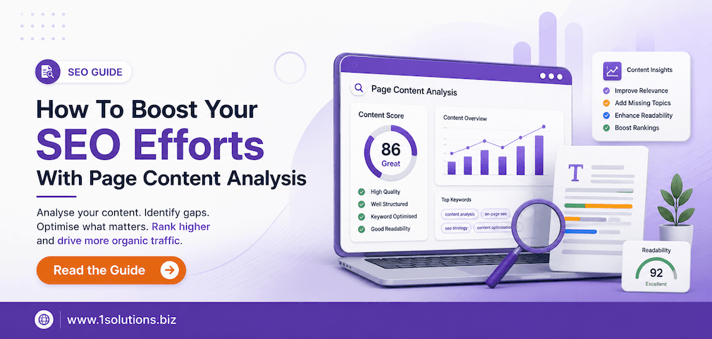
This matters even more for large sites with hundreds or thousands of pages. At scale, managing canonical tags across two parallel URL structures is error-prone. Audits become more complex, redirects multiply, and any CMS update risks breaking the sync between desktop and mobile versions. If you are working on improving your on-page signals and content quality alongside this technical cleanup, the approach covered in boosting SEO with page content analysis pairs well with a responsive redesign.
6. Improved Crawl Efficiency Uses Your Budget More Effectively
Crawl budget refers to the number of pages Googlebot will crawl on your site within a given period. For large websites, this is a real constraint. When you run separate desktop and mobile sites, you effectively double the number of URLs Googlebot needs to visit to index all your content. Half your crawl budget goes to the mobile version, half to the desktop version, leaving less capacity for new and updated content to be discovered quickly.
A responsive site presents a single set of URLs, which means Googlebot can spend its entire crawl allocation on discovering and re-indexing your actual content rather than processing duplicates. This results in faster indexing of new pages and quicker reflection of content updates in search results, a meaningful competitive advantage if you publish frequently.
Crawl efficiency also improves because there are no redirect chains between device-specific URLs. Every internal link resolves in one hop. This cleaner architecture supports better PageRank flow across your site, which is why internal linking strategy matters so much. The principles explained in using internal links to boost backlink impact are far easier to execute and maintain on a responsive site than on a fragmented multi-URL setup.
💡 Pro Tip: After launching or migrating to a responsive design, submit your updated sitemap in Google Search Console and monitor the Coverage report for any crawl anomalies. Early detection of indexing issues prevents ranking disruptions.
7. Structured Data and Rich Results Are Easier to Maintain
Structured data markup, the schema.org vocabulary that powers rich results like star ratings, FAQ accordions, product prices, and breadcrumbs, must be present on the version of the page Google indexes. With mobile-first indexing active, that means structured data must be on the mobile version. On separate desktop/mobile URL setups, developers sometimes add schema only to the desktop template and forget the mobile one, resulting in rich results dropping out of search listings.
Responsive design eliminates this maintenance gap. Because the HTML is the same across all devices, structured data added once applies everywhere. This makes rich result eligibility more reliable and reduces the risk of losing enhanced search features after template updates or CMS migrations.
Rich results matter for click-through rates. A BrightEdge study (2022) found that organic results with rich snippets received a 677% higher click-through rate compared to results without them. Protecting your structured data implementation through responsive design is a low-effort way to preserve a high-impact ranking advantage. This is equally relevant for local businesses, where schema for reviews, addresses, and opening hours feeds directly into local pack visibility, a topic covered in depth in local AEO best practices for small businesses.
8. Social Sharing and Earned Media Amplify SEO Gains
Social shares are not a direct Google ranking factor, but they are a strong indirect one. When a piece of content is shared widely on social platforms, it earns visibility, which leads to more organic backlinks as other writers and publishers reference it. The connection between social amplification and link acquisition is well-established in the SEO community.
Responsive design helps here because mobile users share content far more frequently than desktop users. When your pages render beautifully on a smartphone, the friction to share drops dramatically. A user reading your article on their phone can tap share, paste it into a social post, or send it in a message in seconds. A page that requires zooming, horizontal scrolling, or that clips images awkwardly discourages this behavior.
For e-commerce and content-heavy sites, this sharing behavior compounds over time. Each share creates new opportunities for backlinks, brand mentions, and referral traffic, all of which contribute to domain authority growth. If you want to amplify this effect deliberately through paid social channels, understanding the mechanics covered in our step-by-step guide to Facebook advertising gives you a structured way to put responsive content in front of larger audiences. More reach means more chances for organic link acquisition from those who discover your content through paid promotion.
| SEO Factor | Separate Mobile Site | Responsive Design |
|---|---|---|
| URL Structure | Duplicate URLs, split equity | Single URL, full equity consolidation |
| Crawl Efficiency | Budget split across two site versions | Full budget on one URL set |
| Duplicate Content Risk | High, requires careful canonical management | None, one canonical per page |
| Structured Data Maintenance | Must sync across two templates | Added once, applies everywhere |
| Page Speed Optimization | Two separate performance pipelines | One optimized pipeline |
| Core Web Vitals | Often weaker on mobile version | Consistent across devices when optimized |
| User Engagement Signals | Lower if mobile UX is inferior | Higher with consistent, fluid experience |
9. Voice Search and AI-Powered Search Favor Responsive, Fast Pages
Voice search queries are almost exclusively performed on mobile devices. When someone asks their phone a question and Google returns an answer, it pulls from pages that load quickly, present clean HTML, and deliver content in a format the crawler can parse efficiently. Responsive design checks all three boxes. Pages that are not mobile-optimized rarely appear in voice search results because the experience would be unusable if a user clicked through.
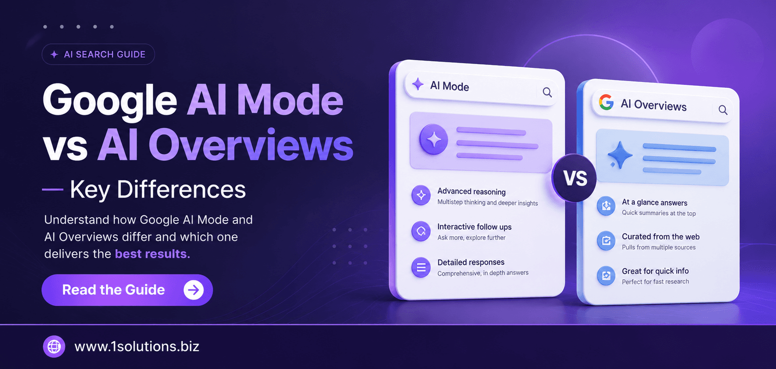
The rise of AI-driven search interfaces adds another dimension. Google’s AI Overviews and other generative search features draw from pages that are well-structured, authoritative, and technically sound. The differences between these formats are worth understanding, as explored in this analysis of Google AI Mode versus AI Overviews. In both cases, the underlying requirement is the same: your page must be crawlable, fast, and accessible on any device.
This is also relevant for agentic browsers and AI agents that browse the web on behalf of users. As explained in the breakdown of what agentic browsers are and how they work, these automated systems evaluate page quality programmatically. A responsive, well-structured site is far more likely to be interpreted correctly by these systems than a fragmented desktop-only or poorly synchronized mobile site. Preparing for AI-driven search is not separate from responsive design; it is an extension of the same technical discipline.
💡 Pro Tip: Structure your responsive pages with clear heading hierarchies (H1, H2, H3) and concise paragraph openings. This improves both voice search snippet eligibility and AI Overview inclusion, since both formats favor content that answers questions directly and early.
10. Long-Term SEO Maintenance Becomes Significantly Simpler
SEO is not a one-time project. It requires ongoing technical audits, content updates, link building, and adaptation to algorithm changes. Every one of these ongoing tasks is simpler and less expensive on a responsive site compared to a dual-URL setup. When Google releases a core update, you audit one site. When you update a page’s content, you update it once. When you fix a broken link, you fix it in one place. This operational simplicity has real compounding value over months and years.
Teams that maintain separate desktop and mobile sites often discover that the two versions drift apart over time. Desktop gets new features, mobile does not. Content gets updated on one but not the other. Schema gets added to the wrong template. Each of these gaps creates SEO risk that compounds silently until an audit reveals the damage. Responsive design prevents this class of problem entirely by design.
For small businesses especially, where development resources are limited, this simplicity is a genuine competitive advantage. A well-built responsive site from a team that understands both development and SEO can outperform a more complex multi-site setup maintained by a larger organization with divided attention. If you are evaluating your current setup or planning a migration, exploring tailored SEO services built for small businesses can help you prioritize the right technical and content investments alongside your responsive build. The long-term payoff in reduced maintenance burden and consistent rankings is substantial.
Practical Action Plan: What to Do With This Information
- Do This Now: Audit your site in Google Search Console under the Mobile Usability report. Identify any pages flagged for mobile errors and prioritize fixing them. If your site is not yet responsive, request a quote for a responsive rebuild before your next major content push, because technical debt accumulates faster than most teams expect.
- Worth Doing: Run a Core Web Vitals audit using PageSpeed Insights for five to ten of your most trafficked pages. Document baseline scores, then implement responsive image optimization (srcset, WebP format, lazy loading) and measure the improvement. Pair this with a structured data audit to confirm schema is rendering correctly on mobile.
- Low Priority: Investigate whether your current CMS theme or framework supports CSS container queries, the next evolution beyond media queries for truly component-level responsive design. This is emerging technology worth understanding but does not require immediate action for most sites.
Conclusion: Responsive Design Is Not Optional for SEO
When you find out how responsive web design equals to SEO benefits, the picture that emerges is clear: RWD is not just about aesthetics or usability. It is the technical backbone that determines how efficiently Google can crawl your site, how cleanly your link equity accumulates, how well you perform on Core Web Vitals, and how reliably your structured data delivers rich results. The 10 points above cover the full spectrum from crawl efficiency to AI search readiness, and each one represents a real, measurable impact on your rankings.
The honest caveat is that responsive design alone is not sufficient. You still need quality content, a clean backlink profile, and ongoing optimization. But without a responsive foundation, every other SEO investment you make is working against friction that did not need to exist. Fix the foundation first, then build.
If you want expert guidance on aligning your technical setup with a results-driven SEO strategy, explore what a dedicated search engine optimization partner can do for your site’s long-term performance.
Frequently Asked Questions
Does responsive web design directly improve Google rankings?
Yes, in multiple measurable ways. Responsive design supports mobile-first indexing, improves Core Web Vitals scores, eliminates duplicate content risks, and consolidates link equity on a single URL. Each of these factors contributes to how Google evaluates and ranks your pages. The improvement is not automatic; a responsive site still needs quality content and proper technical SEO, but the design choice removes several common ranking obstacles at once.
Is responsive design better than a separate mobile site for SEO?
Google explicitly recommends responsive design over separate mobile URLs (m.dot sites) in its own documentation. The primary reasons are simpler crawl architecture, no duplicate content issues, and easier canonical tag management. Separate mobile sites can work when perfectly maintained, but the operational complexity and the risk of content drift between versions make them harder to keep optimized long-term.
How does responsive design affect page speed?
Responsive design removes the redirect overhead associated with separate mobile URL setups, which improves Time to First Byte. When combined with responsive image techniques like srcset and modern formats like WebP, it also reduces the total page weight delivered to mobile devices. However, a bloated responsive theme can still perform poorly. The design approach creates the opportunity for speed; proper optimization delivers it.
Does responsive design help with local SEO?
Yes. Local searches are disproportionately mobile-driven, with users searching for businesses near them while on the go. A responsive site ensures those users get a functional experience when they click through from local search results or Google Maps. It also makes it easier to maintain consistent structured data for local business schema, which feeds directly into local pack rankings and visibility.
What is the biggest mistake businesses make with responsive design and SEO?
The most common mistake is assuming that a responsive theme automatically handles everything. Teams often install a responsive WordPress theme and consider the job done, without auditing Core Web Vitals, checking whether structured data renders correctly on mobile, verifying that images are properly sized for small screens, or testing navigation usability on actual devices. Responsive design is the starting point, not the finish line.
