


Mobile commerce has revolutionized the way people shop and pay for items. It allows customers to purchase goods and services from the comfort of their own homes or on the go. M-commerce is an excellent way to save time, money, and energy, as shopping can be done quickly and securely through a mobile device such as a smartphone or tablet.
Mobile eCommerce is projected to exceed $3.56 trillion, with the mobile commerce market share expected to reach 79.2 percent of total global eCommerce sales. This is an incredible milestone – and one that shoppers everywhere should be aware of as they make their purchasing decisions.
M-commerce is becoming increasingly popular among consumers, as it offers convenience and flexibility that traditional eCommerce solutions are unable to provide.
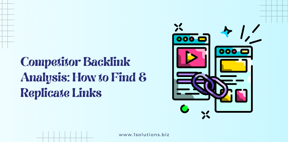
Common Problems Faced by Customers Due to Improperly Optimized mobile eCommerce Site
Mobile eCommerce sites have become increasingly popular in the last few years due to their convenience and accessibility.
However, if a mobile eCommerce site has been improperly optimized, customers can end up dealing with a variety of common problems.
For example, they might encounter slow loading times or pages that are difficult to maneuver and navigate. Additionally, many apps will crash or freeze when users click on various functions or links.
Furthermore, it’s not uncommon for products and services to be inaccurately displayed due to a mobile site having an outdated design or layout.
These types of issues can frustrate customers, leading to lost revenue and diminished satisfaction.
Therefore, it’s critical for online businesses to ensure that their mobile sites are properly optimized in order to avoid any unnecessary problems and ensure an enjoyable user experience.
However, as a business owner using Shopify as your eCommerce platform, you must understand the importance of optimizing your store for mobile devices in order to make the most out of this growing trend.
Shopify development is gaining popularity day by day, but one should ensure that their website is optimized for mobile devices properly.
Fortunately, there are a variety of ways that you can optimize your Shopify store for mobile users.
1. Optimize ‘Tap Targets
Through extensive research and testing, optimizing tap targets on a Shopify page can make a world of difference in user experience.
Making buttons and other tap targets at least 48 pixels wide and adding 32 pixels of white space between each creates easy-to-click elements that result in better customer engagement with the page.
Incorporating this optimization technique as part of your development process can result in higher customer satisfaction with your product while also promoting customer loyalty.
2. Keep Easy Navigation
A successful mobile store design is dependent on easy navigation.
If a customer can’t move quickly and seamlessly through your store, they are likely to become frustrated and leave.
The key is to create a structure where the customer can quickly find what they came for.
Utilizing drop-down menus, intuitive labels, and other navigational elements ensures your customers will always be able to navigate your store without any unwanted delays or frustrations.
Building an effective navigation structure into your Shopify store design isn’t just crucial for providing a good experience- it could also be the difference between success and failure.
3. Reduce Too Much Text
Text plays a huge role in grabbing customers’ attention, insisting they stay and explore your mobile store.
If the text is too much, however, it might be overwhelming for customers and lead them away from your store empty-handed.
To avoid this, keep the text on your site concise and succinct by focusing on the primary information customers require while browsing.
Doing so also encourages customers to interact with other features such as images or videos conveniently placed within your page as they look up for their desired products.
4. Utilize Mobile-Friendly Images
Images are an important part of mobile stores; they can effectively introduce a product to customers and help them decide which item is right for their needs.
Because of this, it is key that the images used on mobile stores are optimized to display properly on smaller screens and load quickly so the customer doesn’t have to wait.
Utilizing mobile-friendly images will ensure that your customers get a pleasant shopping experience and are more likely to remain loyal customers.
By taking the time to make sure your Shopify store’s images are optimized for any kind of device, you can make sure that your customers experience the best possible service when using your store.
5. Incorporate Mobile Payment Options
Mobile payments provide both convenience and security for customers and store owners alike, so it is only natural that more and more businesses are integrating them into their services.
With mobile payment options, customers can quickly and easily pay for purchases with just a few taps on their smartphone screen instead of having to enter long strings of numbers or wait in line at the register.
Store owners also benefit from these arrangements as they make transactions safe, secure, and efficient. Get ahead of the curve by making sure to include mobile payment options when you set up your Shopify store!
6. Clear Call-to-Action Button
Your Shopify store will significantly benefit from having a clear call-to-action button that stands out from the other elements.
Placing a visible, well-organized button on your site will prompt shoppers to take action and stay engaged with your site.
Additionally, using one big, bold button can be more inviting for customers and draw their attention better than having several smaller buttons with different actions.
To get the most conversions and engagement out of customers, it’s important to study the placement of your call-to-action button and create the right look, messaging, and color scheme for the best results.
7. Keep Main navigation visible
Having a visible main navigation bar on your mobile store can make a big difference in the customer experience.
It should be extremely easy for customers to use this navigation bar to locate whatever product or page they are looking for.
Make sure it is located at the top of the screen, as this will encourage customers to quickly find what they need.
If you are using a drop-down menu for your navigation bar, be sure to provide clear labeling.
Additionally, it should be easy for customers to navigate back and forth between main pages. This way, customers have no issue finding what they are looking for and they may end up making an impulse purchase while doing so!
By following these tips to optimize your Shopify store for mobile users, you’ll be able to take advantage of the growing trend of mcommerce and provide a better user experience for your customers. This will ultimately lead to more sales and profits for your business.
You can also hire a Shopify developer to take care of these important points and optimize your Shopify store for mobile devices.


 in India