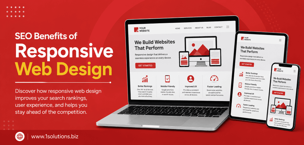
Why Responsive Web Design Matters for SEO
The SEO benefits of responsive web design are no longer a nice-to-have consideration. They are a core part of how search engines evaluate and rank your website. When Google officially shifted to mobile-first indexing, the rules of the game changed permanently. Your site’s ability to adapt seamlessly across screen sizes now directly affects how well it performs in search results.
Responsive web design means your site uses a single codebase and flexible grid layout to display content correctly on any device, from a large desktop monitor to a small smartphone screen. Rather than maintaining separate mobile and desktop versions, one well-built responsive site handles everything. That simplicity has enormous downstream benefits for your SEO strategy.
This article walks through exactly 10 proven SEO advantages of going responsive, with data, practical insights, and honest trade-offs along the way.
Responsive web design gives your site a measurable SEO edge by improving mobile rankings, page speed, user experience, and crawl efficiency. Google recommends it as the preferred configuration. The 10 points below cover every major ranking and usability advantage, along with realistic trade-offs to keep in mind.
⚡ Key Takeaways
- Google uses mobile-first indexing, making responsive design essential for ranking in 2025 and beyond.
- A single responsive URL structure avoids duplicate content issues that hurt separate mobile sites.
- Faster load times on mobile devices directly reduce bounce rates and improve Core Web Vitals scores.
- Responsive sites earn backlinks more efficiently because all link equity flows to one URL.
- Lower long-term maintenance costs free up budget for ongoing SEO and content investment.
- Improved dwell time and lower bounce rates send positive engagement signals to search engines.
- Structured data and schema markup implemented once apply universally across all devices.
The 10 SEO Benefits of Responsive Web Design
1. Google’s Mobile-First Indexing Rewards Responsive Sites
Google completed its rollout of mobile-first indexing, meaning the search engine now primarily uses the mobile version of your content for indexing and ranking. If your site is not built to perform well on mobile devices, your rankings suffer regardless of how strong your desktop experience is. Responsive web design is the configuration Google explicitly recommends because it serves the same HTML to all devices while using CSS to adapt the presentation layer.
According to Statista (2024), mobile devices account for approximately 60% of all global web traffic. Ignoring that audience is not just a user experience mistake. It is an SEO mistake with direct ranking consequences. Sites that rely on separate mobile subdomains (such as m.example.com) often face indexing inconsistencies, where content available on desktop is missing or truncated on mobile.
Responsive sites avoid this entirely. Google crawls one URL, sees consistent content across all viewports, and can index everything without gaps. This gives your pages a clean foundation before any other SEO effort is applied. If you are considering whether your current site architecture is holding back your rankings, understanding why Google may not be indexing your pages is a smart starting point for diagnosing the issue.
2. Elimination of Duplicate Content Across Device Versions
One of the most underappreciated SEO benefits of responsive web design is the way it naturally eliminates duplicate content problems. When businesses run separate desktop and mobile sites, they typically have the same content living at two different URLs. Search engines may treat this as duplicate content, diluting the ranking strength of both versions and creating confusion about which URL to surface in results.
With a responsive design, there is only one URL per page. Every visitor, regardless of device, accesses the same address. This means all ranking signals, including backlinks, social shares, and engagement metrics, flow to a single canonical source. There is no need to set up canonical tags pointing mobile URLs to desktop equivalents, which reduces both technical complexity and the risk of misconfiguration.
This consolidation also simplifies your sitemap. One clean sitemap with one set of URLs is far easier for search engine crawlers to process than managing two parallel site structures. For businesses that have historically maintained separate mobile sites, migrating to responsive design often produces a noticeable improvement in crawl efficiency and indexing consistency within weeks of the change.
💡 Pro Tip: If you are migrating from a separate mobile site to a responsive design, set up 301 redirects from all old mobile URLs to their responsive equivalents. This preserves accumulated link equity and prevents ranking drops during the transition.
3. Improved Page Speed and Core Web Vitals Performance
Page speed is a confirmed Google ranking factor, and Core Web Vitals, which measure loading, interactivity, and visual stability, are part of Google’s Page Experience signals. Responsive web design, when implemented correctly, supports better performance across all three metrics because it avoids the overhead of maintaining redundant code paths for separate site versions.
Google’s own data (Google, 2023) shows that as page load time increases from one second to three seconds, the probability of a mobile user bouncing increases by 32%. A responsive site built with performance in mind, using optimized images, efficient CSS, and minimal render-blocking resources, can serve fast load times across devices from a single codebase.
Separate mobile sites often rely on device detection scripts that add latency. Responsive sites skip that step entirely. The trade-off worth acknowledging here is that a poorly implemented responsive design can actually load more resources than necessary on mobile if images and assets are not properly optimized for smaller screens. Responsive design is not automatically fast. It needs to be built well. Working with experienced developers or partnering with a professional WordPress development team ensures your responsive site is built for both aesthetics and performance from the start.
4. Single URL Structure Consolidates Link Equity
Every time an external website links to your content, that link passes authority, commonly called link equity or PageRank, to the target URL. When you operate separate desktop and mobile versions of your site, incoming links often split between the two. A blogger might link to your desktop URL while a social media post links to the mobile version. The result is diluted authority for both.
Responsive web design concentrates all incoming link equity to a single URL for each piece of content. This is a direct ranking advantage because search engines use link authority as one of their most influential ranking signals. Every backlink your site earns, whether from guest posts, press mentions, or directories, feeds into one consolidated pool of authority per page.
For businesses actively building links, this consolidation amplifies the return on every outreach effort. If you want to understand how to maximize that return, using internal links strategically to boost backlink impact is a tactic that works hand in hand with a responsive site structure. The combination of clean external link consolidation and smart internal linking creates a compounding authority effect across your entire domain.
5. Lower Bounce Rates Through Better User Experience
Bounce rate, the percentage of visitors who leave after viewing only one page, is a strong indirect SEO signal. When users land on a page that displays poorly on their device, they leave quickly. That behavior tells search engines the page did not satisfy the user’s intent, which can suppress future rankings for that query.
According to Google (2023), 61% of users are unlikely to return to a mobile site they had trouble accessing, and 40% will visit a competitor’s site instead. A responsive design eliminates layout breakage, text that is too small to read, buttons that are impossible to tap, and horizontal scrolling that frustrates users. When the experience is smooth across devices, visitors stay longer, explore more pages, and convert at higher rates.
Longer sessions and lower bounce rates send positive behavioral signals back to search engines. Over time, pages with strong engagement metrics tend to hold and improve their rankings relative to competitors with poor mobile experiences. This is especially critical for content-heavy sites where thorough page content analysis can identify which pages are losing visitors due to poor mobile rendering versus weak content quality.
💡 Pro Tip: Use Google Search Console’s Core Web Vitals report filtered by mobile to identify which responsive pages are underperforming. Fix the lowest-scoring pages first for the fastest ranking impact.
6. Faster Crawl Efficiency for Search Engine Bots
Search engine crawlers operate on a budget. Googlebot does not crawl every page on your site every day. It allocates a crawl budget based on your site’s authority, speed, and structure. Responsive web design improves crawl efficiency in two specific ways: it reduces the total number of URLs that need to be crawled, and it eliminates redirect chains between desktop and mobile versions.
When Google crawls a responsive site, it needs to visit only one URL per piece of content. On a site with separate mobile pages, every page effectively exists twice. For large websites with thousands of pages, this doubles the crawl demand without providing any additional value to users or search engines. The result is that less important pages get crawled more often while critical new content may be delayed in indexing.
A cleaner URL architecture also reduces the risk of crawl errors. Redirect loops, broken canonical tags, and inconsistent hreflang configurations are all common problems on dual-site architectures. Responsive design largely sidesteps these issues. For larger sites struggling with indexing delays, diagnosing Google indexing problems often reveals that site architecture inefficiency, not content quality, is the root cause of the delay.
7. Unified Social Sharing and Brand Signal Consistency
Social sharing may not be a direct Google ranking factor, but it contributes to SEO indirectly through several mechanisms: increased content visibility leads to more natural backlinks, broader brand recognition influences branded search volume, and consistent URL sharing prevents link dilution across platforms. Responsive web design supports all three mechanisms by ensuring that every shared link points to the same URL.
When users share content on social platforms from a mobile device, the URL that gets shared is the page they are viewing. On a responsive site, that URL is identical to the desktop version. On a separate mobile site, the shared URL might be an m. subdomain that accumulates shares and engagement separately from the desktop version, fragmenting the social proof associated with that content.
Brand consistency across devices also reinforces trust. When a user discovers your brand through a social post on mobile, then revisits via desktop, a responsive site delivers a coherent visual and functional experience. This continuity reduces friction and improves brand recall, which can increase direct and branded search traffic over time. Strong branded search signals are a positive indicator of site authority in Google’s ranking systems.
8. Better Local SEO Performance on Mobile Searches
Local search queries are disproportionately mobile. When someone searches for a nearby service or business, they are almost always on a smartphone. Google’s local pack results, the map listings that appear at the top of local queries, prioritize pages that deliver a fast and clean mobile experience. A responsive website is foundational to performing well in local SEO because it ensures that users clicking through from local results land on a page that works properly on their device.
According to Think with Google (2023), 76% of people who search for something nearby on their smartphone visit a business within one day, and 28% of those searches result in a purchase. If your site serves those users a broken or slow mobile experience, you lose conversions that your search ranking successfully delivered. Responsive design bridges the gap between ranking and converting in local search.
For businesses investing in local visibility, pairing a responsive site with structured local SEO strategy compounds results significantly. Local AEO best practices for small businesses offer a complementary approach that works best when your underlying site structure is mobile-ready. Our local SEO packages are specifically designed to maximize visibility for businesses serving location-based audiences.
💡 Pro Tip: After launching or updating your responsive site, submit your updated sitemap through Google Search Console and request indexing for your most important local landing pages to accelerate their appearance in mobile local results.
9. Reduced Long-Term Technical Debt and SEO Maintenance Costs
Running two separate website versions, one for desktop and one for mobile, creates double the technical maintenance burden. Every time you update content, fix a bug, adjust navigation, or implement a new SEO strategy, you need to replicate those changes across both versions. This is not just time-consuming. It is a source of ongoing inconsistencies that can harm SEO when the two versions fall out of sync.
Responsive web design consolidates all maintenance into a single codebase. A content update happens once and appears correctly on all devices. An SEO change to your meta tags, schema markup, or internal linking structure applies universally. This efficiency means your development and SEO teams spend less time on duplication and more time on strategic improvements that actually move rankings.
The cost savings are also real. Agencies and in-house teams that maintain single responsive sites consistently report lower ongoing maintenance costs compared to dual-site setups. Those savings can be reinvested into content creation, link building, or professional search engine optimization services that drive compounding long-term growth. The honest trade-off is that building a well-executed responsive site requires more thoughtful upfront planning and development investment than a basic desktop-only site.
10. Future-Proofing Your SEO Against Evolving Device Landscapes
The device landscape is not static. Tablets, foldable phones, smart TVs, and wearables represent an expanding range of screen sizes and interaction models. Responsive web design, built on flexible grid principles and relative units, adapts to new device types without requiring a complete rebuild. This adaptability is a long-term SEO advantage because it ensures your site remains accessible and performant as technology evolves.
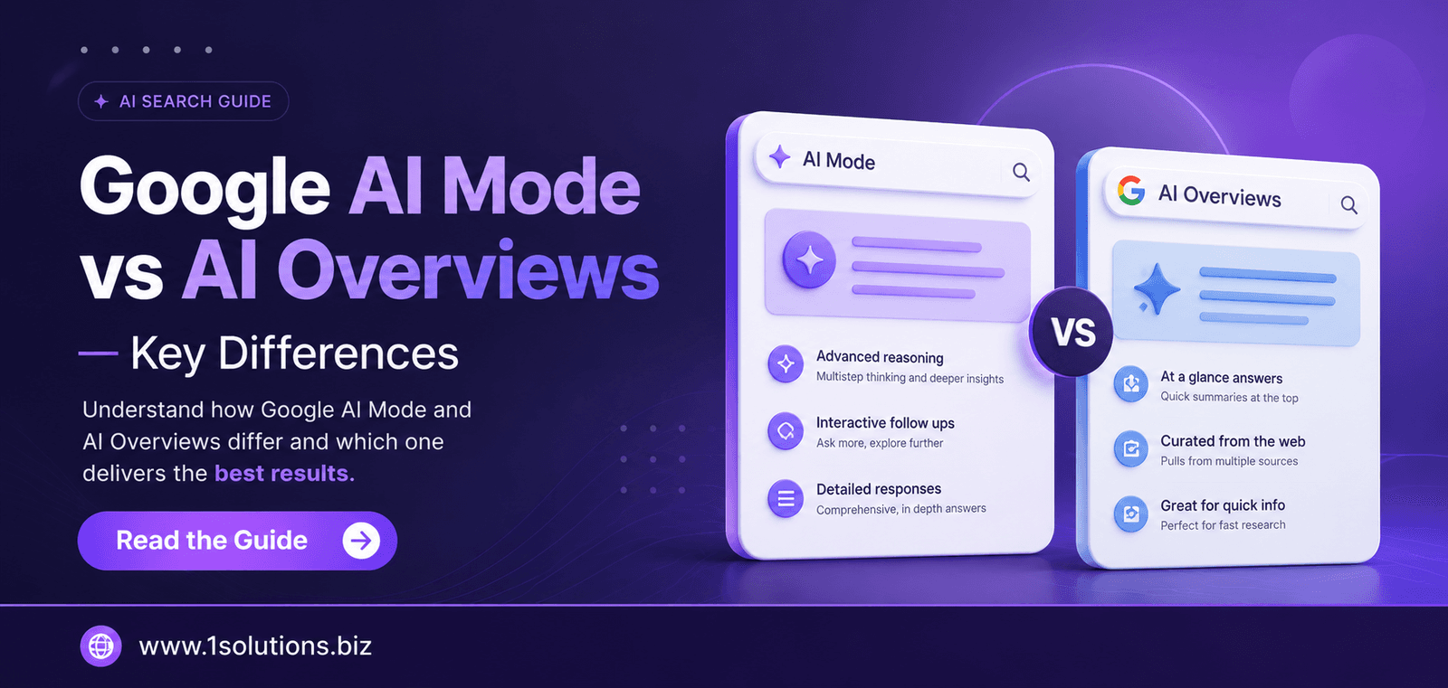
Emerging developments in how search engines operate are also worth watching. Google’s AI Overviews and AI Mode are changing how search results are presented, with AI-generated summaries drawing content from pages that are well-structured and easy to parse. A responsive site with clean HTML, logical heading hierarchy, and consistent content across devices is better positioned for AI-driven indexing and featured snippet extraction than a fragmented dual-site setup.
Additionally, as agentic browsers become more prevalent in how users interact with the web, the ability of your site to render cleanly across automated and AI-driven access patterns will become increasingly important. Responsive design, with its reliance on standard HTML and CSS rather than device-specific scripts, aligns well with how these emerging technologies parse and interact with web content. Investing in responsiveness now is investing in SEO resilience for years ahead.
Responsive vs. Non-Responsive: SEO Impact at a Glance
| SEO Factor | Responsive Design | Separate Mobile Site |
|---|---|---|
| URL Structure | Single URL per page | Duplicate URLs (m. subdomain) |
| Link Equity | Consolidated to one URL | Split between two versions |
| Crawl Efficiency | One URL crawled per page | Double the crawl demand |
| Duplicate Content Risk | None | High without canonical tags |
| Maintenance Effort | Single codebase | Two codebases to maintain |
| Mobile-First Indexing | Fully compatible | Risk of content inconsistencies |
| Core Web Vitals Optimization | One set of improvements needed | Separate optimization required |
Practical Action Plan: Where to Start
- Do This Now: Run your site through Google’s Mobile-Friendly Test and PageSpeed Insights. Identify any pages that fail mobile usability checks or score below 50 on mobile performance. These are your most urgent fixes because they directly affect current rankings.
- Do This Now: If your site runs on a separate mobile subdomain, audit the content consistency between versions. Inconsistencies in content, structured data, or navigation between desktop and mobile are active ranking liabilities. Plan a migration to responsive design with proper 301 redirects in place.
- Worth Doing: Audit your internal linking structure after implementing responsive design. A single URL architecture allows internal links to pass authority more cleanly. Review your most important pages and ensure they receive strong internal links from high-traffic responsive pages.
- Worth Doing: Implement or audit your structured data markup. Responsive sites make it easier to deploy schema once and have it apply universally. Use Google’s Rich Results Test to confirm your markup is correctly parsed on mobile.
- Low Priority: Explore advanced responsive techniques such as responsive images using the srcset attribute and container queries in CSS. These are performance enhancements that matter more after the foundational responsive structure is solid and your Core Web Vitals scores are already healthy.
Conclusion
The SEO benefits of responsive web design span every layer of how search engines discover, evaluate, and rank your content. From mobile-first indexing compatibility and duplicate content elimination to faster crawl efficiency and future-proofing against emerging technologies, responsive design is not just a best practice. It is a structural SEO requirement for any site serious about organic growth.
The trade-offs are real but manageable. A responsive site requires thoughtful upfront development and ongoing performance optimization. But the alternative, maintaining separate site versions or ignoring mobile performance, carries far greater long-term SEO costs. If you are ready to align your site architecture with the direction search is heading, exploring professional SEO services or a comprehensive digital marketing strategy can help you get there faster and more effectively.
Frequently Asked Questions
Does responsive web design directly improve Google rankings?
Yes, in multiple ways. Google uses mobile-first indexing, meaning the mobile version of your site is the primary basis for ranking. A responsive site ensures your content is consistently accessible on mobile, which aligns with this indexing approach. Additionally, responsive design supports better Core Web Vitals scores, lower bounce rates, and cleaner URL structures, all of which contribute to stronger rankings.
Is responsive design better than a separate mobile site for SEO?
For most websites, yes. Google itself recommends responsive design over separate mobile sites because it avoids duplicate content issues, consolidates link equity to a single URL, and simplifies crawling. Separate mobile sites introduce risks of content inconsistencies, split link authority, and higher maintenance complexity. The main scenario where a separate mobile experience might still be considered is for very large enterprise sites with highly specialized mobile requirements, but even then, responsive design is the preferred starting point.
How does responsive design affect page speed?
Responsive design can support faster page speed, but it does not guarantee it automatically. A well-built responsive site avoids the latency of device-detection scripts and reduces code duplication, which helps performance. However, if responsive images are not properly sized or if CSS and JavaScript are not optimized, a responsive site can still load slowly on mobile. Performance optimization must be applied alongside the responsive framework.
Can an existing non-responsive site be converted to responsive without losing SEO value?
Yes, with proper planning. The key steps are maintaining the same URL structure where possible, setting up 301 redirects for any URLs that change, updating your sitemap, and informing Google of the changes through Search Console. If done correctly, a responsive redesign typically improves SEO performance within weeks rather than hurting it. The risk comes from poor redirects or major content removal during the redesign process.
Does responsive design help with local SEO specifically?
Yes, significantly. Local searches are heavily mobile-driven. A responsive site ensures users clicking through from local pack results land on a page that functions properly on their smartphone. This improves conversion rates from local traffic and reduces the bounce signals that can suppress local rankings over time. Pairing a responsive site with an optimized Google Business Profile and consistent local citations creates the strongest foundation for local search performance.

