


In 2021, search engine optimization (SEO) is about to shake up. Google’s mobile-first indexing update, scheduled for early 2021, would fully remove from Google’s index all desktop-only pages and photos or properties on a desktop-only platform. The aim of Google is to switch all pages to mobile-first indexing. All the SEO companies are ensuring that their client’s website is fully prepared for this update to avoid any downfall in the organic rankings.
Google will specifically use only the mobile edition of the content for indexing and rating, due to the ubiquity of smartphones and tablets. But before we look at some of the mobile-first indexing best practices, let’s clear up any possible misunderstanding about the update and what it entails.
Earlier Google’s ranking system looked at the desktop version of a website page and ranked it accordingly to the users. However, over a period of time, there was a user shift from desktop to mobile devices. The rendering of pages on mobile is different than on desktop and there was a need to have a search algorithm that supports mobile devices as well. That’s when Google decided to introduce Mobile-First Indexing.
Currently, mobile-first indexing is the norm, and for a while, it has been. For indexing, any website that is new to the internet or Google Search as of 1 July 2019 uses mainly the mobile version of the website.
The indexes for Mobile-First and Desktop are the same. The update means Google can use the mobile version of a website for indexing and ranking rather than the desktop version.
What Are the Mobile-First Indexing Best Practices?

Now that you have a clear understanding of mobile-first indexing and what it means, let’s explore some of the best practices to ensure smooth sailing in March 2021 that you can now incorporate.
1. Implement Responsive Web Design
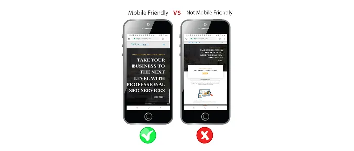
If you haven’t already, it’s time for you to join 70% of mobile-optimized websites. With responsive web design, you will accomplish this. A responsive website means that, regardless of the platform or screen size, visitors can see an optimized version of the site. Because of its versatility, a responsive website is beneficial: responsive web design ensures that website owners do not have to build several versions of their websites to accommodate different devices.
Mobile-first indexing does not have a huge impact on the success of your site on the search engine results pages if you already have a responsive web design (SERPs). These web design instruments will assist you if you are at the stage of working on the responsive design of your website. Google has explicitly said that sensitive websites that correctly use responsive design do not need to make any adjustments at all.
2. Make Sure Googlebot Can Access Your Mobile Website

Googlebot is the web crawler app from Google, and your content needs to be able to navigate and make it. Enable Googlebot to analyze the resources of your site and ensure that different URLs from your desktop site are available on your mobile site. Also, remember to check if the URL may be blocked by a disallow order.
You need to use similar meta robot tags on your mobile and desktop pages to make sure your site ranks. When your website is allowed for mobile-first indexing, various meta robot tags could result in Google failing to crawl and index your page.
Lastly, make sure that you do not use “lazy loading” for primary content. Lazy loading is a technique of optimization that defers content loading that is neither apparent nor critical. Bear in mind that Googlebot will refuse to load content that, like typing or clicking, requires any user interactions to be loaded.
3. Keep Your Site Identical Across Its Desktop and Mobile Versions

Users should not be penalized for using a laptop instead of a tablet or mobile. Exactly the same content as your mobile site should be on your desktop site. If your mobile site has fewer or different content at the moment, you may want to update it.
Take a closer look at your headlines as you compare your content in all versions of your website. Keep your headlines consistent and make sure that on the mobile edition of your site they are aesthetically pleasing.
On the same note, you need to ensure that you have the same experience on all versions of your site as a website owner. One of the best ways to provide your guests with a consistent experience that appeals to them is consistency in all versions of your website.
4. Analyze Your Structured Data

You need to ensure that it is present on your mobile and web pages if you have decided to organize your data and that both have the same structured data.
You will need to make sure that the URLs are changed to the web URLs in the mobile versions of structured data.
5. Double-Check Your Ad Placements

If you’re not careful about where you put them, advertising will influence your mobile page rating. Refer to the Best Ads Norm when you display your advertisement on a mobile device and make sure it follows the requirements.
6. Pay Attention to Your Visual Content

On the mobile edition of your website, any photos or videos have their own set of best practices to follow. You need to provide the users with high-quality images in a supported format when it comes to images. Be sure to only provide images that, when viewed on a smaller screen, have ample high resolution and do not look too small.
Try not to use URLs that alter when a page loads images for images and videos because if the URLs keep changing, Google will be unable to correctly process and index your images.
It needs to be easily found on a mobile device as far as video content is concerned, and should be put in a supported format and related tags. You don’t want a video to be put too far down the list, causing users to scroll forever. Here, too, the best practice for structured data applies; on the mobile and desktop versions of your site, you want to keep this data similar.
Final Words
Things are swiftly changing. Nowadays, most people who are online tend to access the internet rather than on a screen on their mobile devices. That’s because of the ease and comfort provided by mobile devices. The decision of Google to move to mobile-first indexing is an amazing way to react to this and shows how much we rely on mobile.
So, now is the time to do so if your website is not yet configured for both mobile and desktop users.


 in India