What is Mobile SEO? Understanding the Foundation
If you have ever asked yourself, what is mobile SEO and how does it affect my website’s rankings, you are not alone. Mobile SEO refers to the process of optimizing your website so that it performs well in mobile search results and delivers a smooth, fast, and readable experience to users on smartphones and tablets. With Google now using mobile-first indexing as its default, your mobile site is essentially the version that gets crawled, evaluated, and ranked, not your desktop version.
This guide breaks down exactly what mobile SEO involves, why it matters more than ever, and six actionable ways to optimize your site for mobile search right now.
Mobile SEO is the practice of optimizing your website for search engines and users on mobile devices. Google now indexes your mobile site first, which means poor mobile performance directly hurts your rankings. This guide covers six practical optimization strategies, from page speed to structured data, that you can implement step by step.
⚡ Key Takeaways
- Mobile-first indexing means Google ranks your mobile site version, not your desktop version.
- Over 60% of all web traffic now comes from mobile devices, making mobile optimization non-negotiable.
- Page speed is one of the most critical and measurable mobile SEO factors.
- Responsive design is the recommended approach by Google for mobile compatibility.
- Core Web Vitals scores directly influence your mobile search rankings.
- Structured data and local SEO signals have an outsized impact on mobile search results.
- Mobile UX problems like intrusive pop-ups and small tap targets can trigger ranking penalties.
Why Mobile SEO Matters More Than Ever
The numbers make a clear case. According to Statista (2024), mobile devices account for approximately 60.67% of global website traffic. Google confirmed its switch to mobile-first indexing for all websites back in 2023, meaning if your mobile experience is poor, your rankings suffer across the board, even for desktop searches.
According to Google’s own research (2023), 53% of mobile users will abandon a page that takes longer than three seconds to load. That is more than half your potential audience gone before they read a single word. And according to Think with Google (2022), mobile searches related to “near me” have grown over 500% in recent years, which directly ties mobile SEO to local search performance.
The shift is not just about traffic volume. Mobile users behave differently. They use shorter queries, rely heavily on voice search, and expect instant answers. Optimizing for mobile SEO means adapting to those behaviors, not just resizing a desktop layout.
💡 Pro Tip: Use Google Search Console’s “Mobile Usability” report to get a fast overview of which pages on your site have mobile-specific issues. Fix the ones affecting your highest-traffic pages first.
Mobile SEO vs. Desktop SEO: Key Differences
Before diving into the six optimization methods, it helps to understand how mobile SEO differs from traditional desktop SEO. They share the same fundamentals, but the execution varies significantly.
| Factor | Desktop SEO | Mobile SEO |
|---|---|---|
| Indexing Priority | Secondary (since 2023) | Primary (Google mobile-first) |
| Page Speed Target | Under 3 seconds | Under 2 seconds recommended |
| Design Approach | Fixed or fluid layouts | Responsive or adaptive design |
| Navigation | Multi-level menus | Thumb-friendly, simplified menus |
| Content Format | Longer paragraphs accepted | Short paragraphs, scannable content |
| Local Signals | Moderate impact | High impact (near-me searches) |
| Pop-ups | Tolerated with limits | Penalized if intrusive on mobile |
Way 1: Make Your Site Responsive (and Test It Properly)
Responsive design is the practice of building your website so that its layout, images, and text automatically adjust to fit any screen size. Google officially recommends responsive design over separate mobile URLs (m.dot sites) or dynamic serving because it is simpler to manage and less prone to crawling errors.
Here is how to implement this step by step:
- Audit your current site: Use Google’s Mobile-Friendly Test tool (search.google.com/test/mobile-friendly) to see how your pages perform right now.
- Choose a responsive framework: If you are building on WordPress, most modern themes are responsive by default. Make sure you verify this, not just assume it.
- Test across multiple devices: Chrome DevTools lets you simulate dozens of screen sizes for free. Test at minimum 375px (iPhone SE), 390px (iPhone 14), and 768px (iPad).
- Check text readability: Body text should be at least 16px. Anything smaller forces users to pinch and zoom, which signals a poor experience.
- Verify tap targets: Buttons and links should be at least 48×48 pixels with enough spacing between them so users do not accidentally tap the wrong element.
If your site is built on WordPress, working with a reliable WordPress development partner ensures your theme and custom code are genuinely responsive, not just visually adjusted on one device.
Way 2: Improve Mobile Page Speed Aggressively
Page speed is not just a user experience factor, it is a confirmed ranking signal. Google’s Core Web Vitals update made this official, and the Largest Contentful Paint (LCP), First Input Delay (FID), and Cumulative Layout Shift (CLS) metrics are now baked into how your pages are evaluated.
Specific steps to speed up your mobile pages:
- Compress and convert images: Use WebP format instead of JPEG or PNG. Images are typically the largest assets on any page. Tools like Squoosh or ShortPixel automate this.
- Enable lazy loading: Add the
loading="lazy"attribute to images below the fold so they only load when a user scrolls to them. - Minify CSS, JavaScript, and HTML: Remove unnecessary whitespace and comments from your code. Plugins like WP Rocket or NitroPack handle this automatically for WordPress sites.
- Use a Content Delivery Network (CDN): A CDN serves your assets from servers geographically close to the user, reducing load time significantly.
- Eliminate render-blocking resources: Defer non-critical JavaScript and load CSS efficiently so the browser can render the page without waiting for scripts to fully execute.
- Check your hosting: Cheap shared hosting is often the silent killer of mobile page speed. Consider upgrading to managed hosting if your load times are consistently above two seconds.
You can read more about how content structure affects your overall SEO performance in this detailed breakdown: how to boost your SEO efforts with page content analysis.
💡 Pro Tip: Run your URL through PageSpeed Insights (pagespeed.web.dev) and look specifically at the “Mobile” tab. The Opportunities section tells you exactly what to fix and estimates how much time each fix could save.
Way 3: Optimize for Mobile-First Indexing
Mobile-first indexing does not mean you need a separate mobile site. It means Google uses the mobile version of your content to determine rankings. This has specific implications for how you structure your content.
Step-by-step checklist for mobile-first indexing compliance:
- Ensure all content is visible on mobile: If you hide text or sections behind tabs or accordions on mobile that are fully visible on desktop, Google may not give that content full weight.
- Carry over all structured data: If you have Schema markup on your desktop pages, make sure it is also present on the mobile version. Missing structured data on mobile means missing rich results.
- Match meta tags across versions: Your title tags, meta descriptions, and canonical tags must be consistent between your desktop and mobile versions.
- Avoid blocking resources: Make sure Googlebot Smartphone can crawl your CSS and JavaScript files. Blocking them in robots.txt will prevent Google from rendering your pages correctly.
- Use the same images: Do not serve significantly lower quality or smaller images on mobile to save bandwidth. Google indexes the images too, and image search traffic matters.
This connects directly to why some pages do not get indexed at all. If you are experiencing indexing gaps, the article on why Google is not indexing your page covers the most common culprits.
Way 4: Optimize Site Structure and Navigation for Mobile Users
Desktop users can tolerate complex navigation menus and multi-column layouts. Mobile users cannot. A confusing navigation structure on mobile increases bounce rates, reduces time on site, and signals to Google that your user experience is poor.
Here is how to simplify your mobile navigation effectively:
- Use a hamburger menu or bottom navigation bar: Keep primary links accessible without cluttering the screen. Bottom navigation bars are increasingly common because they are thumb-friendly.
- Limit top-level menu items: Aim for five or fewer primary navigation options on mobile. Anything more overwhelms users and slows decision-making.
- Add a visible search bar: Many mobile users prefer searching within a site to navigating menus. A persistent search icon in the header goes a long way.
- Simplify your URL structure: Short, descriptive URLs are easier to read and share on mobile. Avoid long parameter strings where possible.
- Use breadcrumbs: Breadcrumb navigation helps users understand where they are and Google understand your site’s hierarchy. Make sure breadcrumbs render correctly on mobile.
Internal linking is another structural element that pays dividends on mobile. Proper internal links help Google discover your content and help users move through your site efficiently. Our guide on how to use internal links to boost backlink impact explains how to approach this strategically.
Way 5: Optimize for Local and Voice Search
Mobile and local search are tightly connected. When someone pulls out their phone to search for a product or service, they are often looking for something nearby and they want an answer fast. Voice search amplifies this, since most voice queries happen on mobile devices and tend to be conversational and location-based.
Steps to optimize for mobile local and voice search:
- Claim and optimize your Google Business Profile: Make sure your name, address, phone number, hours, and photos are complete and accurate. This directly feeds local pack results.
- Use consistent NAP (Name, Address, Phone) data: Your business information should match exactly across your website, Google Business Profile, and any directory listings.
- Target conversational long-tail keywords: Voice queries sound like questions. Optimize pages to answer questions like “what is the best X near me” or “how do I find Y.” Use FAQ sections to capture these naturally.
- Add LocalBusiness Schema markup: Structured data helps search engines understand your business type, location, and offerings and increases your chance of appearing in rich results on mobile.
- Optimize page load speed for 4G and 5G users: Mobile users on networks outside of WiFi may experience slower speeds. Test your site performance on throttled connections, not just fast WiFi.
For small businesses especially, getting mobile local SEO right is one of the highest-return activities you can invest in. If you are looking for expert help, our SEO services for small businesses are built to handle exactly this kind of foundational work.
You can also learn more about combining local and answer-based optimization by reading this guide on local AEO best practices for small businesses.
💡 Pro Tip: Add an FAQ section to your key service and landing pages. FAQ content is one of the most reliable ways to capture voice search queries and trigger featured snippets in mobile search results.
Way 6: Fix Mobile UX Issues That Hurt Rankings
Google has stated clearly that it will demote pages with poor mobile user experience. Two specific UX issues have known penalties attached to them: intrusive interstitials (pop-ups) and poor Core Web Vitals scores.
Here is how to audit and fix mobile UX problems:
- Remove or resize intrusive pop-ups: Full-screen pop-ups that appear immediately when a user lands on a mobile page are a confirmed ranking negative. Use smaller banners, slide-ins, or exit-intent triggers instead.
- Fix Cumulative Layout Shift (CLS): CLS measures how much elements move around as the page loads. Common causes include images without set dimensions and ads that load and push content down. Set explicit width and height attributes on all images.
- Improve Interaction to Next Paint (INP): Google replaced FID with INP in March 2024. INP measures how quickly the page responds after any user interaction, not just the first one. Reduce JavaScript execution time to improve this score.
- Audit and simplify forms: Mobile users abandon multi-field forms fast. Reduce the number of fields, use appropriate input types (tel, email, number) so the right keyboard appears, and support autofill.
- Avoid horizontal scrolling: Any element wider than the viewport creates horizontal scroll, which is a clear sign of a broken mobile layout. Use overflow:hidden carefully and test all content widths.
If you are managing an ecommerce site, mobile UX issues on product pages and checkout flows directly affect conversion rates, not just rankings. Our ecommerce SEO packages include mobile UX audits as part of the full optimization process.
For broader context on how algorithm changes can affect your mobile rankings, it is worth reviewing what happened in recent updates. The Google March 2026 Spam Update is a recent example of how quality signals, including UX, can shift rankings quickly.
Practical Action Plan: Mobile SEO Prioritized
Not everything on this list needs to happen at once. Here is a realistic priority framework:
- Do This Now: Run Google’s Mobile-Friendly Test and PageSpeed Insights on your five most important pages. Fix any critical errors flagged under Mobile Usability in Google Search Console. These have the most immediate ranking impact.
- Do This Now: Compress all images on your homepage and landing pages and convert them to WebP format. This is typically a one-time fix with a significant speed impact.
- Worth Doing: Implement responsive design site-wide if you have not already, and audit your navigation for simplicity. This is a medium-effort project with long-term benefits.
- Worth Doing: Add LocalBusiness and FAQ Schema markup to relevant pages. This is a moderate technical task that improves both local and voice search visibility.
- Worth Doing: Audit and fix pop-ups and layout shift issues. These require development work but have direct ranking implications.
- Low Priority: Experiment with Progressive Web App (PWA) features like offline support and push notifications. These improve user experience further but require significant development investment and are better suited for later-stage optimization.
- Low Priority: Test bottom navigation bars and advanced mobile UX patterns. Worth A/B testing once the core technical issues are resolved.
How Comprehensive SEO Services Support Mobile Optimization
Mobile SEO is not a one-time task. It is an ongoing process that involves technical audits, content adjustments, speed monitoring, and keeping up with Google’s evolving algorithms. If you are managing this alongside running a business, it is easy for issues to slip through.
Working with a dedicated team that handles the full picture, from technical crawling to content strategy, ensures that mobile SEO stays current as Google updates its standards. Our professional SEO services cover mobile audits, Core Web Vitals optimization, structured data implementation, and ongoing performance tracking so your site does not fall behind.
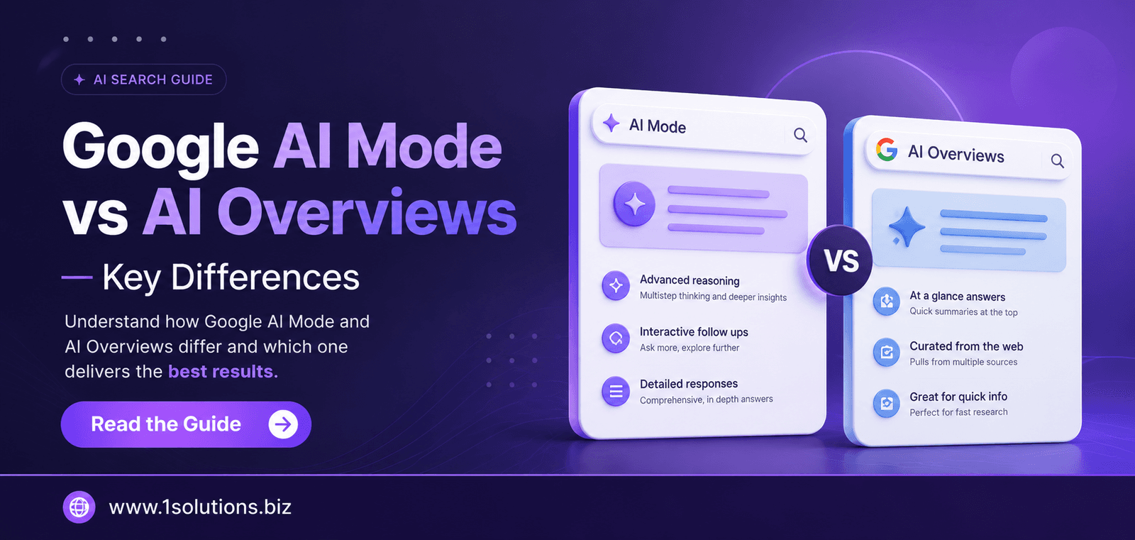
The same principle applies if you want to understand how newer search behaviors, like AI-powered results, affect your mobile visibility. Our recent breakdown of Google AI Mode vs AI Overviews explains how these changes are reshaping what users see on mobile search results pages.
What is Mobile SEO? The Conclusion
To answer the core question directly: mobile SEO is the practice of optimizing your website to rank well in mobile search results and provide a fast, readable, and frictionless experience to users on mobile devices. Given that Google indexes the mobile version of your site first and that the majority of search traffic now comes from phones and tablets, mobile SEO is not a specialization. It is the foundation of SEO itself.
The six ways covered in this guide, responsive design, page speed, mobile-first indexing compliance, simplified navigation, local and voice search optimization, and UX issue fixes, are not isolated tactics. They reinforce each other. A fast, responsive site with clean navigation and accurate local data will consistently outperform one that has been optimized only for desktop.
Start with the audit steps, prioritize the highest-impact fixes first, and treat mobile optimization as a continuous process rather than a project with a finish line.
Frequently Asked Questions About Mobile SEO
What is the difference between mobile SEO and regular SEO?
Regular SEO covers optimization for all devices and search contexts. Mobile SEO focuses specifically on how your site performs on smartphones and tablets, including page speed on mobile networks, responsive design, touch-friendly navigation, and signals that affect mobile search rankings specifically. Since Google uses mobile-first indexing, mobile SEO is now the primary layer that affects your overall search performance.
Does having a responsive website mean my mobile SEO is fully covered?
Not entirely. Responsive design is an important starting point, but it does not automatically address page speed, Core Web Vitals scores, structured data, local signals, or content readability on small screens. Mobile SEO requires ongoing attention across all of those dimensions, not just a flexible layout.
How do I know if my site has mobile SEO problems?
Start with three free tools: Google Search Console (Mobile Usability report), Google’s Mobile-Friendly Test, and PageSpeed Insights (mobile tab). Together, these will identify the majority of issues affecting your mobile rankings and user experience. Google Search Console also shows you mobile-specific click and impression data so you can see how mobile users find your site versus desktop users.
Does mobile page speed affect desktop rankings too?
Yes, because Google’s mobile-first index means the mobile version of your page determines how you rank for both mobile and desktop searches. If your mobile page is slow and receives poor Core Web Vitals scores, those scores feed into your overall ranking signals, which can suppress your visibility even for desktop queries.
How long does it take to see results from mobile SEO improvements?
It depends on the changes made and how frequently Google crawls your site. Technical fixes like page speed improvements and structured data additions can be reflected in rankings within a few weeks. Layout and UX changes may take longer to show clear ranking movement since Google needs to recrawl, re-evaluate, and update its index. Consistent improvements over three to six months typically produce measurable results in mobile search performance.

